Brief: The owner wanted the race medal and wider event materials to feel distinct from a generic sports medal, something that carried the story of the race, not just a logo.
Insight: A logo applied to a standard disc would feel interchangeable. The story needed to be built into the object itself.
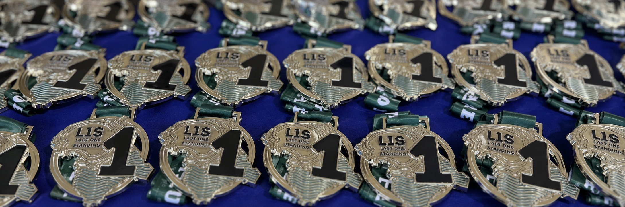
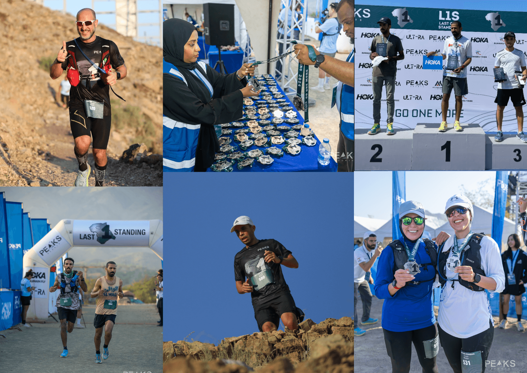
Action: I used the actual race track as the medal’s outline, engraving mountain contour lines and incorporating Peaks Sports’ moss green for texture and depth. A supporting ring structurally held the shape while housing the ribbon slot. This system (track outline, contour texture and ribbon) then scaled across the trophy, apparel, race bibs and finishers’ arch.
Outcome: The collaboration continued across three races before ending for logistical reasons unrelated to the work, reinforcing that the design system was successful for the client.
Last One Standing RACE
Brief: The owner wanted the race medal and wider event materials to feel distinct from a generic sports medal, something that carried the story of the race, not just a logo.
Insight: A logo applied to a standard disc would feel interchangeable. The story needed to be built into the object itself.
Action: I used the actual race track as the medal’s outline, engraving mountain contour lines and incorporating Peaks Sports’ moss green for texture and depth. A supporting ring structurally held the shape while housing the ribbon slot. This system (track outline, contour texture and ribbon) then scaled across the trophy, apparel, race bibs and finishers’ arch.
Outcome: The collaboration continued across three races before ending for logistical reasons unrelated to the work, reinforcing that the design system was successful for the client.
Brief: The owner wanted the race medal and wider event materials to feel distinct from a generic sports medal, something that carried the story of the race, not just a logo.
Insight: A logo applied to a standard disc would feel interchangeable. The story needed to be built into the object itself.
Action: I used the actual race track as the medal’s outline, engraving mountain contour lines and incorporating Peaks Sports’ moss green for texture and depth. A supporting ring structurally held the shape while housing the ribbon slot. This system (track outline, contour texture and ribbon) then scaled across the trophy, apparel, race bibs and finishers’ arch.
Outcome: The collaboration continued across three races before ending for logistical reasons unrelated to the work, reinforcing that the design system was successful for the client.
SHAWKA HUMP RACE
Brief: With Shawka Hump, the brief was to adapt a similar system, without using the same visuals. The new race needed its own identity while still reading as part of one family.
Insight: The value in the Last One Standing design was never the mountain itself; it was the underlying logic: track outline and contour texture reflecting the environment of the race. Proving that logic could carry a completely different landscape would show it was a system, not a one-off design.
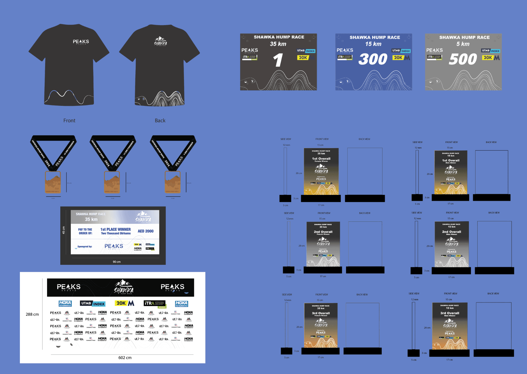
Action: I rebuilt the same contour approach around a camel motif in place of the mountain, creating a core visual for the race. This became the key visual of the race, being applied across all necessary touchpoints.
Brief: With Shawka Hump, the brief was to adapt a similar system, without using the same visuals. The new race needed its own identity while still reading as part of one family.
Insight: The value in the Last One Standing design was never the mountain itself; it was the underlying logic: track outline and contour texture reflecting the environment of the race. Proving that logic could carry a completely different landscape would show it was a system, not a one-off design.
Action: I rebuilt the same contour approach around a camel motif in place of the mountain, creating a core visual for the race. This became the key visual of the race, being applied across all necessary touchpoints.