Track Covers

Various DJ's from the dnb and techno scene asked me to design covers for their tracks. I spoke a lot with each dj before starting each design concept about what their track represents and what they want the cover to convey. The direction for every cover came directly out of these conversations, the brief was rarely more than a feeling or a few words. Translating that into a visual language was the actual design problem.
Various DJ's from the dnb and techno scene asked me to design covers for their tracks. I spoke a lot with each dj before starting each design concept about what their track represents and what they want the cover to convey. The direction for every cover came directly out of these conversations, the brief was rarely more than a feeling or a few words. Translating that into a visual language was the actual design problem.
Brief: This was the DJ’s first produced set and they wanted a cover that visualised it. Their only direction: it should feel like an acid trip of someone running through Berlin.
Insight: This was also early in my own career as a graphic designer and I was drawing on 2000s-era track cover aesthetics for reference. I wanted the piece to hold dimension without losing a flat, two-dimensional graphic quality, a tension I found in a lot of that era’s design.
Action: I built movement into the typography itself, letting the type carry the “running” energy rather than relying only on imagery. The flat but dimensional approach came from layering shape and colour rather than depth or shadow.
(Track has been unpublished by DJ due to style change)
Brief: Before our meeting, I sent over some questions to help them think through what the album represented and what they wanted the cover to show. They gravitated towards hand-drawn, surrealist covers with a human, alive feel rather than anything static, and wanted the palette centred on blue. Overall, theclient wanted a surrealistic representation of the whole EP.
Insight They were not specific on symbols, but nostalgia and reflection kept coming up. I first pushed towards a surrealistic playground built around growing up, but they steered away from anything too childish the nostalgia they meant was closer to a life you no longer have, like a relationship that has ended. So I steered more towards reflection: literally looking into a mirror, softened with a water-ripple distortion into something dreamier. They responded to that mood straight away, so I built around it. We also discussed adding symbols that represented the tracks in the EP, creating almost a small museum of this reflection.
Action I hand-drew Felix’s face twice, looking into and out of the mirror, then brought both into Photoshop to build the final piece. Mixing flat and 3D elements gave it a layered, almost museum-like quality, held together by blue throughout.
Brief: This was the DJ’s first produced set and they wanted a cover that visualised it. Their only direction: it should feel like an acid trip of someone running through Berlin.
Insight: This was also early in my own career as a graphic designer and I was drawing on 2000s-era track cover aesthetics for reference. I wanted the piece to hold dimension without losing a flat, two-dimensional graphic quality, a tension I found in a lot of that era’s design.
Action: I built movement into the typography itself, letting the type carry the “running” energy rather than relying only on imagery. The flat but dimensional approach came from layering shape and colour rather than depth or shadow.
(Track has been unpublished by DJ due to style change)
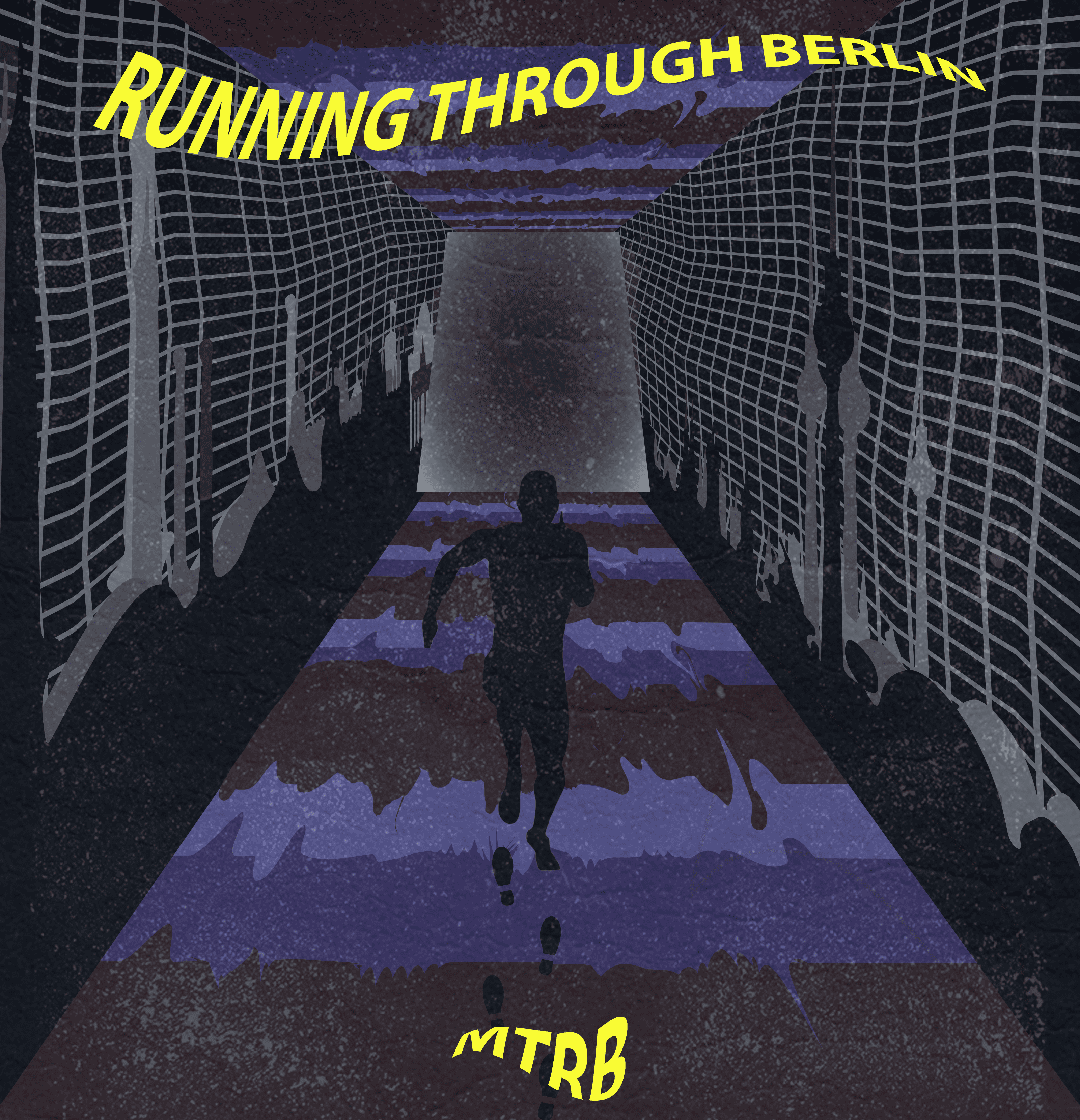
running through berlin - mtrb
running through berlin - mtrb
Brief :The DJ’s gave me very minimal direction here - just “go with the feel of it.” The track itself is intense, high-energy techno.
Insight: With so little steering from the DJ, the track itself became the brief. I decided the cover needed to match the intensity but through a cartoony, exaggerated lens rather than a literal or dark one, closer to demons breaking loose than a horror aesthetic.
Action: I experimented in the Adobe AI suite to construct the demons and globe, building up layers of lava and fire until the image read as the world being set alight from within.
(Track has been unpublished by DJ due to style change)
Brief: Before our meeting, I sent over some questions to help them think through what the album represented and what they wanted the cover to show. They gravitated towards hand-drawn, surrealist covers with a human, alive feel rather than anything static, and wanted the palette centred on blue. Overall, theclient wanted a surrealistic representation of the whole EP.
Insight They were not specific on symbols, but nostalgia and reflection kept coming up. I first pushed towards a surrealistic playground built around growing up, but they steered away from anything too childish the nostalgia they meant was closer to a life you no longer have, like a relationship that has ended. So I steered more towards reflection: literally looking into a mirror, softened with a water-ripple distortion into something dreamier. They responded to that mood straight away, so I built around it. We also discussed adding symbols that represented the tracks in the EP, creating almost a small museum of this reflection.
Action I hand-drew Felix’s face twice, looking into and out of the mirror, then brought both into Photoshop to build the final piece. Mixing flat and 3D elements gave it a layered, almost museum-like quality, held together by blue throughout.
Brief :The DJ’s gave me very minimal direction here - just “go with the feel of it.” The track itself is intense, high-energy techno.
Insight: With so little steering from the DJ, the track itself became the brief. I decided the cover needed to match the intensity but through a cartoony, exaggerated lens rather than a literal or dark one, closer to demons breaking loose than a horror aesthetic.
Action: I experimented in the Adobe AI suite to construct the demons and globe, building up layers of lava and fire until the image read as the world being set alight from within.
(Track has been unpublished by DJ due to style change)
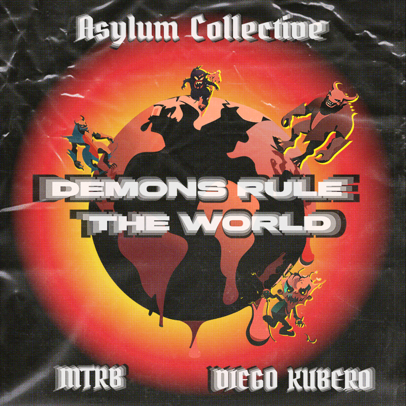
Demons Rule the World - mtrb & Diego Kubero
Demons Rule the World - mtrb & Diego Kubero
Two-sided design for a vinyl release.
Brief: The DJ wanted a front and back cover pairing for vinyl. The intent: a track to listen to when relaxing, in good weather, just trying to feel good.
Insight: Colour needed to carry the emotional weight before any imagery did, so I picked orange, blue and yellow to evoke summer. I wanted to keep the more illustrative project for the back side of the vinyl cover, so I decided to take a more abstract/hallucinogenic approach for the front cover.
Action: Front cover: sun rays radiating outward, with a gradient suggesting sand meeting sea - simple, atmospheric, restrained.
Back cover: built out the more illustrative half of the pair, translating a shared idea from our conversation; that the music should feel like it was flying away, floating. This led me to creating a vinyl record transforming into a bird and flying into the sunset.


WATERCOLOUR - SYLLAS
WATERCOLOUR - SYLLAS
WATERCOLOUR - SYLLAS
Two-sided design for a vinyl release.
Brief: The DJ wanted a front and back cover pairing for vinyl. The intent: a track to listen to when relaxing, in good weather, just trying to feel good.
Insight: Colour needed to carry the emotional weight before any imagery did, so I picked orange, blue and yellow to evoke summer. I wanted to keep the more illustrative project for the back side of the vinyl cover, so I decided to take a more abstract/hallucinogenic approach for the front cover.
Action: Front cover: sun rays radiating outward, with a gradient suggesting sand meeting sea - simple, atmospheric, restrained.
Back cover: built out the more illustrative half of the pair, translating a shared idea from our conversation; that the music should feel like it was flying away, floating. This led me to creating a vinyl record transforming into a bird and flying into the sunset.
Brief: Before our meeting, I sent over some questions to help them think through what the album represented and what they wanted the cover to show. They gravitated towards hand-drawn, surrealist covers with a human, alive feel rather than anything static, and wanted the palette centred on blue. Overall, theclient wanted a surrealistic representation of the whole EP.
Insight They were not specific on symbols, but nostalgia and reflection kept coming up. I first pushed towards a surrealistic playground built around growing up, but they steered away from anything too childish the nostalgia they meant was closer to a life you no longer have, like a relationship that has ended. So I steered more towards reflection: literally looking into a mirror, softened with a water-ripple distortion into something dreamier. They responded to that mood straight away, so I built around it. We also discussed adding symbols that represented the tracks in the EP, creating almost a small museum of this reflection.
Action I hand-drew Felix’s face twice, looking into and out of the mirror, then brought both into Photoshop to build the final piece. Mixing flat and 3D elements gave it a layered, almost museum-like quality, held together by blue throughout.
Brief: Before our meeting, I sent over some questions to help them think through what the album represented and what they wanted the cover to show. They gravitated towards hand-drawn, surrealist covers with a human, alive feel rather than anything static, and wanted the palette centred on blue. Overall, the client wanted a surrealistic representation of the whole EP.
Insight: They were not specific on symbols, but nostalgia and reflection kept coming up. I first pushed towards a surrealistic playground built around growing up, but they steered away from anything too childish the nostalgia they meant was closer to a life you no longer have, like a relationship that has ended. So I steered more towards reflection: literally looking into a mirror, softened with a water-ripple distortion into something dreamier. They responded to that mood straight away, so I built around it. We also discussed adding symbols that represented the tracks in the EP, creating almost a small museum of this reflection.
Action: I hand-drew Felix's face twice, looking into and out of the mirror, then brought both into Photoshop to build the final piece. Mixing flat and 3D elements gave it a layered, almost museum-like quality, held together by blue throughout.
Brief: Before our meeting, I sent over some questions to help them think through what the album represented and what they wanted the cover to show. They gravitated towards hand-drawn, surrealist covers with a human, alive feel rather than anything static, and wanted the palette centred on blue. Overall, theclient wanted a surrealistic representation of the whole EP.
Insight They were not specific on symbols, but nostalgia and reflection kept coming up. I first pushed towards a surrealistic playground built around growing up, but they steered away from anything too childish the nostalgia they meant was closer to a life you no longer have, like a relationship that has ended. So I steered more towards reflection: literally looking into a mirror, softened with a water-ripple distortion into something dreamier. They responded to that mood straight away, so I built around it. We also discussed adding symbols that represented the tracks in the EP, creating almost a small museum of this reflection.
Action I hand-drew Felix’s face twice, looking into and out of the mirror, then brought both into Photoshop to build the final piece. Mixing flat and 3D elements gave it a layered, almost museum-like quality, held together by blue throughout.
Brief: Before our meeting, I sent over some questions to help them think through what the album represented and what they wanted the cover to show. They gravitated towards hand-drawn, surrealist covers with a human, alive feel rather than anything static, and wanted the palette centred on blue. Overall, the client wanted a surrealistic representation of the whole EP.
Insight They were not specific on symbols, but nostalgia and reflection kept coming up. I first pushed towards a surrealistic playground built around growing up, but they steered away from anything too childish the nostalgia they meant was closer to a life you no longer have, like a relationship that has ended. So I steered more towards reflection: literally looking into a mirror, softened with a water-ripple distortion into something dreamier. They responded to that mood straight away, so I built around it. We also discussed adding symbols that represented the tracks in the EP, creating almost a small museum of this reflection.
Action I hand-drew Felix’s face twice, looking into and out of the mirror, then brought both into Photoshop to build the final piece. Mixing flat and 3D elements gave it a layered, almost museum-like quality, held together by blue throughout.
The Uncurated Soul - Felix Ravestein
The Uncurated Soul - Felix Ravestein

